Graphs and Data
Graphs and Data
Key Concepts
-
Graphs and data are ways of showing information clearly so we can:
- read values
- compare results
- spot patterns
- describe changes
- draw conclusions
-
In PSLE Mathematics, graphs and tables are often used to show:
- data collected from surveys or measurements
- changes over time
- comparisons between groups
- relationships between quantities
-
When reading any graph or table, always look at:
- the title
- the labels
- the units
- the scale
- the key or legend, if any
-
A title tells you what the graph or table is about.
-
A label tells you what each axis, row, column, or section represents.
-
A unit tells you how the measurement is recorded, such as:
- cm
- g
- °C
- minutes
- %
-
A scale shows the value of each division or marking on an axis.
- Example: each small square may represent 1 unit, 2 units, 5 units, or 10 units.
- You must read the scale carefully before giving an answer.
-
A variable is something that can change in an experiment.
- Example: time, temperature, height of plant, amount of water
-
The x-axis is the horizontal axis.
- It usually shows the independent variable, often time or categories.
-
The y-axis is the vertical axis.
- It usually shows the dependent variable, which is what is measured.
-
The independent variable is the factor that is changed on purpose.
- Example: number of days, amount of light, type of material
-
The dependent variable is the factor that is measured or observed.
- Example: plant height, temperature, distance moved
-
Data analysis means studying the information shown to:
- identify highest and lowest values
- compare data
- describe increases or decreases
- find patterns or relationships
- support conclusions with evidence
Reading and Interpreting Bar Graphs
-
A bar graph uses rectangular bars to show and compare values in different groups or categories.
-
In a bar graph:
- each bar represents one category
- all bars should have the same width
- bars are separated by spaces
- the height or length of each bar shows the value
-
Bar graphs are useful for comparing:
- number of students
- types of animals
- amounts of rainfall in different months
- number of seeds germinated under different conditions
-
To read a bar graph:
- Read the title.
- Check what the x-axis and y-axis represent.
- Look at the unit on the y-axis.
- Read the scale carefully.
- Match the top of the bar to the correct value.
-
When comparing bars, use scientific language such as:
- “A has the highest value.”
- “B is lower than C.”
- “The difference between A and D is 5 units.”
-
If asked to find the difference, subtract:
- larger value − smaller value
-
If asked to find the total, add all relevant values.
Line Graphs and Trends
-
A line graph uses plotted points joined by lines to show how something changes, usually over time.
-
Line graphs are useful for showing:
- temperature changes during the day
- plant growth over weeks
- water level changes over time
- speed changes during motion
-
In a line graph:
- the x-axis usually shows time or another continuous variable
- the y-axis shows the measured value
- each point represents one reading
- points are connected to show change or trend
-
A trend is the general pattern in the data.
-
Common trends:
- increase: values go up
- decrease: values go down
- constant: values stay the same
- fluctuate: values go up and down
-
When describing a line graph, use words like:
- increases gradually
- increases sharply
- decreases slowly
- remains constant
- reaches a maximum
- reaches a minimum
-
A maximum is the highest value.
-
A minimum is the lowest value.
-
If a line rises from left to right:
- the measured value is increasing
-
If a line falls from left to right:
- the measured value is decreasing
-
If the line is horizontal:
- the measured value remains constant
-
To interpret trends in Science:
- do not just describe the graph
- connect it to the scientific idea if the question asks for it
- Example: “The plant grew taller over 5 days, showing that growth increased with time.”
Pie Charts
-
A pie chart is a circle divided into sectors to show parts of a whole.
-
The whole circle represents:
- the total amount
- 100%
- 360°
-
Each sector represents a category.
-
The larger the sector:
- the greater the amount or percentage
-
Pie charts are useful for showing:
- fractions
- percentages
- proportions
-
To read a pie chart:
- Read the title.
- Check the labels or legend.
- Find the fraction, percentage, or angle for each sector.
- Compare sector sizes.
-
Important facts:
- full circle = 360°
- half circle = 180°
- quarter circle = 90°
- total percentage = 100%
-
If you know the angle of a sector:
- fraction of whole = angle ÷ 360
- percentage = (angle ÷ 360) × 100%
-
If you know the percentage:
- angle = (percentage ÷ 100) × 360°
-
If you know the total number:
- category value = fraction × total
- or category value = percentage × total
-
Example:
- If 25% of a pie chart represents 40 pupils, then total number of pupils is:
- 40 ÷ 25 × 100 = 160 pupils
- A quicker method:
- 25% = 1/4
- total = 40 × 4 = 160
- If 25% of a pie chart represents 40 pupils, then total number of pupils is:
Tables and Diagrams
-
A table organises data into rows and columns.
-
Tables help us:
- read values quickly
- compare observations
- identify patterns
- record experiment results neatly
-
A table usually includes:
- a title
- row headings
- column headings
- units
-
To read a table:
- Read the title.
- Look at the headings.
- Check the units.
- Read values carefully from the correct row and column.
-
In Mathematics, tables often record:
- quantities and amounts
- scores and frequencies
- measurements and lengths
- costs and totals
- time and distance values
-
A diagram is a labelled drawing used to show information clearly.
-
In data questions, diagrams may include:
- pictures with labels
- symbols
- simple visual comparisons
- comparison tables, frequency tables, or schedule diagrams
-
Sometimes a pictogram is used.
- A pictogram uses pictures or symbols to represent data.
- A key tells how much each symbol represents.
- Example: 1 picture = 2 animals
-
Always check the key carefully.
- A half-symbol may represent half the value of one full symbol.
Data Analysis and Comparison
-
Data analysis means examining data carefully to understand what it shows.
-
In PSLE Mathematics data questions, you may need to:
- compare two sets of data
- identify trends or patterns
- state similarities and differences
- read values accurately from graphs or tables
- calculate totals, averages, or percentages from data
-
A comparison tells how two or more things are alike or different.
-
Good comparison answers should:
- mention both items
- use correct values
- include units where needed
- state whether one is greater, smaller, faster, slower, more, less, same, or different
-
Useful comparison phrases:
- “___ is greater than ___.”
- “Both ___ and ___ increased over time.”
- “___ showed the largest change.”
- “The difference between ___ and ___ is ___.”
- “___ remained constant while ___ increased.”
-
A conclusion is a statement that sums up what the data shows.
-
A good scientific conclusion:
- is based only on the data given
- uses evidence from the graph or table
- does not include guesses not supported by data
-
Example:
- Weak conclusion: “Plant A is better.”
- Better conclusion: “Plant A grew the tallest, reaching 18 cm after 4 weeks.”
-
If asked to give evidence:
- quote actual values from the data
- Example: “Group B had 12 seeds germinate, while Group A had 8.”
Important Definitions
-
Bar graph: a graph that uses rectangular bars to show and compare values in different categories.
-
Line graph: a graph that uses points joined by lines to show changes over time or across continuous data.
-
Pie chart: a circle divided into sectors to show parts of a whole.
-
Table: a chart that organises information into rows and columns.
-
Diagram: a labelled drawing or visual representation used to show information clearly.
-
Pictogram: a chart that uses pictures or symbols to represent data.
-
Title: the heading that tells what the graph, table, or chart is about.
-
Axis: a reference line on a graph used for plotting data.
-
X-axis: the horizontal axis on a graph.
-
Y-axis: the vertical axis on a graph.
-
Scale: the value represented by each division on an axis.
-
Unit: the standard measurement used, such as cm, g, min, or °C.
-
Variable: a factor that can change in an experiment.
-
Independent variable: the factor that is changed on purpose.
-
Dependent variable: the factor that is measured or observed.
-
Trend: the general pattern shown by data.
-
Increase: to become greater in value.
-
Decrease: to become smaller in value.
-
Constant: staying the same without change.
-
Maximum: the highest value in a set of data.
-
Minimum: the lowest value in a set of data.
-
Sector: a section of a pie chart.
-
Percentage: a value out of 100.
-
Fraction: a way of showing part of a whole.
-
Data analysis: studying data to identify patterns, compare results, and draw conclusions.
-
Conclusion: a statement that explains what the results show.
-
Evidence: information from the data used to support an answer or conclusion.
Worked Examples
Example 1: Reading a Bar Graph
A bar graph shows the number of beans that germinated in 4 trays.
- Tray A: 6
- Tray B: 10
- Tray C: 8
- Tray D: 4
Question:
Which tray has the highest number of germinated beans, and how many more beans germinated in Tray B than in Tray D?
Step-by-step solution:
-
Find the highest bar.
- Tray A = 6
- Tray B = 10
- Tray C = 8
- Tray D = 4
- Highest value = 10
-
State the tray with the highest number.
- Tray B has the highest number of germinated beans.
-
Find the difference between Tray B and Tray D.
- Tray B = 10
- Tray D = 4
- Difference = 10 − 4 = 6
Answer:
- Tray B has the highest number of germinated beans.
- 6 more beans germinated in Tray B than in Tray D.
Example 2: Interpreting a Line Graph
A line graph shows the height of a plant over 5 weeks.
- Week 1: 4 cm
- Week 2: 6 cm
- Week 3: 9 cm
- Week 4: 9 cm
- Week 5: 12 cm
Question:
Describe the trend in the plant’s growth.
Step-by-step solution:
-
Read the values in order.
- 4 cm → 6 cm → 9 cm → 9 cm → 12 cm
-
Look for changes.
- From Week 1 to Week 3, the height increased.
- From Week 3 to Week 4, the height remained constant.
- From Week 4 to Week 5, the height increased again.
-
Write the trend clearly.
- The plant grew taller overall from Week 1 to Week 5.
- Its height increased from 4 cm to 9 cm in the first 3 weeks, remained constant at 9 cm from Week 3 to Week 4, then increased to 12 cm by Week 5.
Answer:
The plant’s height increased overall. It increased from Week 1 to Week 3, remained constant from Week 3 to Week 4, and increased again from Week 4 to Week 5.
Example 3: Reading and Calculating from a Pie Chart
A pie chart shows how 40 pupils travel to school.
- Bus: 50%
- Car: 25%
- Walk: 15%
- Bicycle: 10%
Question:
How many pupils travel to school by car and by bicycle altogether?
Step-by-step solution:
-
Find the percentage for car and bicycle.
- Car = 25%
- Bicycle = 10%
- Total percentage = 25% + 10% = 35%
-
Calculate 35% of 40 pupils.
- 35% of 40
- = 35/100 × 40
- = 14
-
State the answer.
- 14 pupils travel by car and bicycle altogether.
Answer:
14 pupils
Common Mistakes to Avoid
- Not reading the title of the graph or table.
- Ignoring the units and giving answers without units when needed.
- Reading the scale wrongly.
- Example: each division may represent 2 or 5, not 1.
- Confusing the x-axis and y-axis.
- Saying a value is increasing when the line is actually decreasing.
- Forgetting that a horizontal line means the value is constant.
- Giving a comparison without using actual data values.
- Writing conclusions that are not supported by the data.
- Forgetting to add all parts when finding a total.
- Subtracting in the wrong order when finding a difference.
- In pie charts, forgetting that:
- total angle = 360°
- total percentage = 100%
- Misreading the key in a pictogram.
- Forgetting that a half-symbol represents half the value.
- Copying data wrongly from the wrong row or column in a table.
- Describing only one item when the question asks to compare two items.
Exam Tips
-
Always start by reading:
- the title
- labels
- units
- scale
- key
-
Underline command words such as:
- state
- compare
- describe
- calculate
- conclude
-
For compare questions:
- mention both sets of data
- use words like “higher than”, “lower than”, “same as”
- include values if possible
-
For describe the trend questions:
- use phrases like:
- “increases”
- “decreases”
- “remains constant”
- “increases at first, then remains constant”
- use phrases like:
-
For calculate questions:
- show the working clearly
- write the correct unit in the final answer
-
For conclusion questions:
- base your answer only on the data given
- support your answer with evidence
-
Useful mark-earning phrases:
- “The highest value is…”
- “The lowest value is…”
- “The difference is…”
- “This shows that…”
- “Based on the data…”
- “___ increased from ___ to ___.”
-
If the graph is about an experiment:
- think about the scientific meaning of the trend
- link the data to the experiment result if asked
-
Check your final answer:
- Is the number correct?
- Did you include the unit?
- Did you answer exactly what was asked?
Quick Summary
- Read the title, labels, units, scale, and key before answering.
- A bar graph compares values in different categories.
- A line graph shows changes and trends, often over time.
- A pie chart shows parts of a whole; whole circle = 360° = 100%.
- A table organises data into rows and columns for easy reading.
- A pictogram uses symbols, so always check the key.
- The x-axis is horizontal; the y-axis is vertical.
- A trend may show an increase, decrease, constant value, or fluctuation.
- To compare data, use actual values and words like higher, lower, same, or difference.
- To find a difference, subtract the smaller value from the larger value.
- To find a total, add the values correctly.
- A good conclusion must be based on the data and supported with evidence.
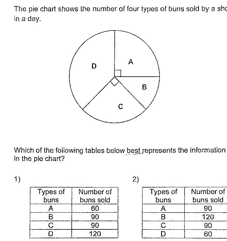
The pie chart shows the number of four types of buns sold by a shop in a day. Which of the following tables below best represents the information in the pie chart?
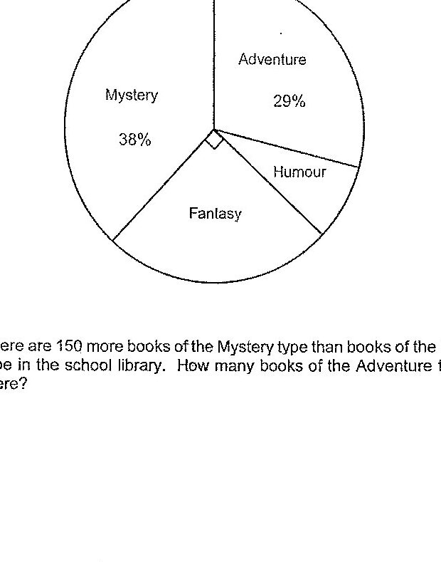
Books in a school library are grouped according to the following four types: Humour, Fantasy, Adventure and Mystery. The pie chart represents the number of books of each type in the school library. There are 150 more books of the Mystery type than books of the Humour type in the school library. How many books of the Adventure type are there?
Which of the three students scored the most number of points? What was the student's points?
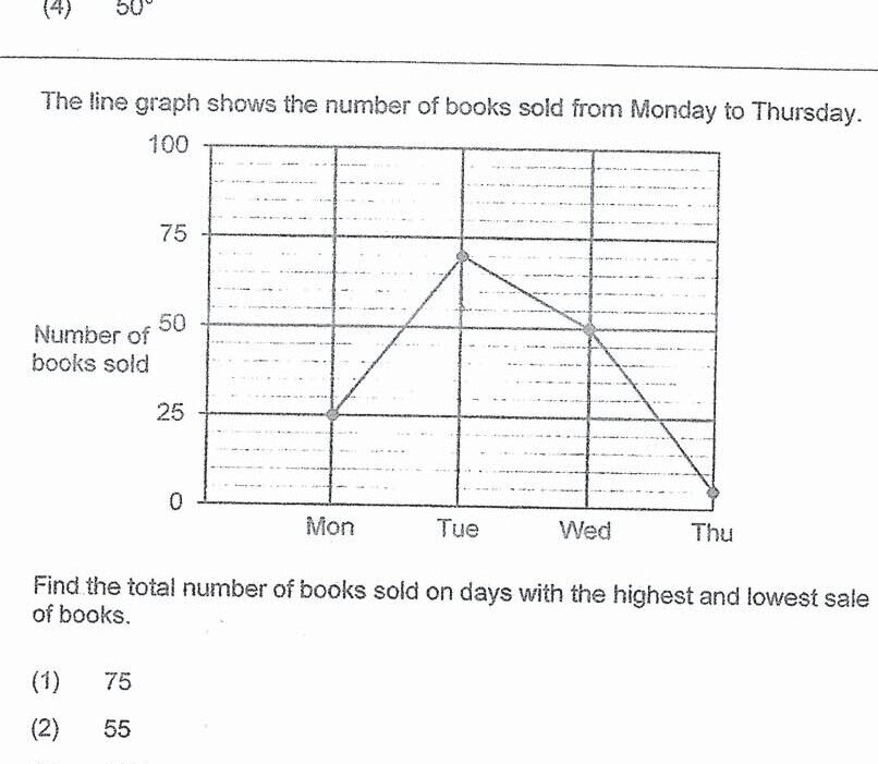
The line graph shows the number of books sold from Monday to Thursday. Find the total number of books sold on days with the highest and lowest sales of books.
How many children chose Cheese? Draw the bar that represents the number of children who chose Cheese in the bar graph above.
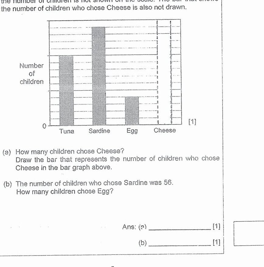
The number of children who chose Sardine was 58. How many children chose Egg?
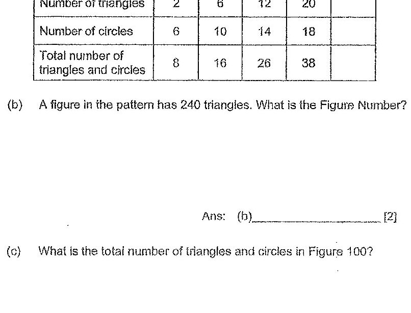
The table shows the number of triangles and circles for the first 4 figures. Complete the table for Figure 5.
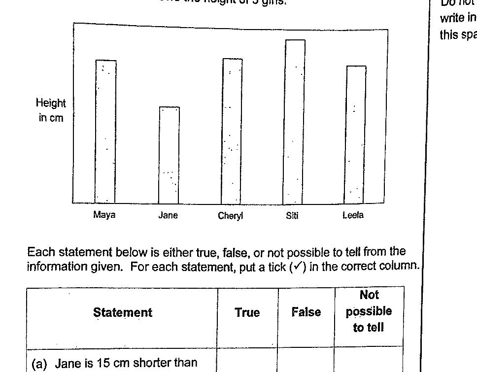
The bar graph below shows the height of 5 girls. Each statement below is either true, false, or not possible to tell from the information given. For each statement, put a tick (✓) in the correct column.
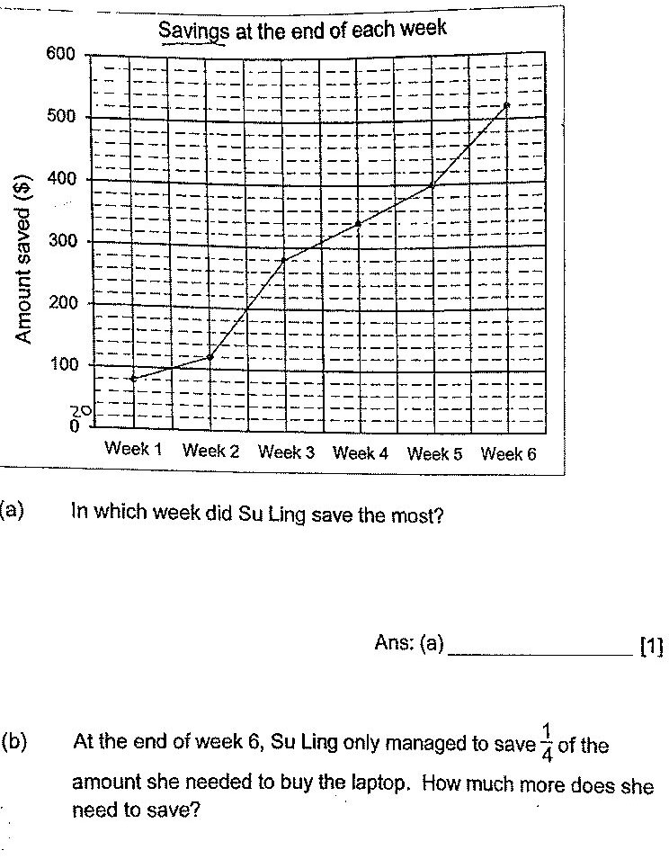
In which week did Su Ling save the most?
The pie chart shows how a group of students travel to school. The bar graph also represents how the same group of students travel to school. The bar for the number of students who travel to school by public bus has not been drawn. Each of the statements below is either true, false or not possible to tell from the information given. For each statement, put a tick (✓) to indicate your answer. Statement 1: There are 400 students altogether.
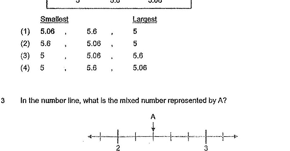
Statement 3: 50 students take public bus to school.

The graph shows the fare a taxi company charges for the first 10 kilometres. John took a taxi and travelled for 9 km. How much did he pay?
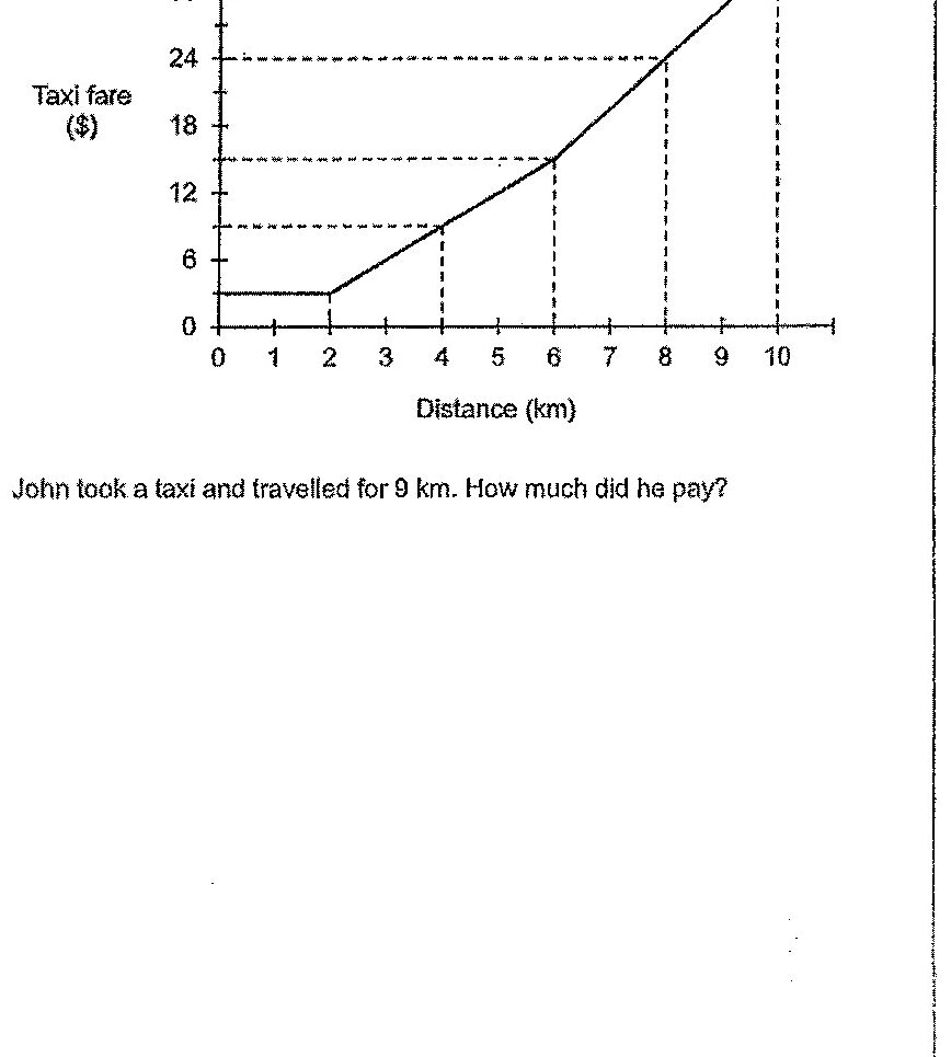
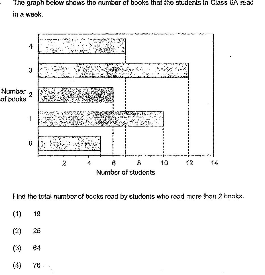
The graph below shows the number of books that the students in Class 6A read in a week. Find the total number of books read by students who read more than 2 books.
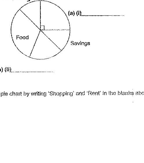
The bar graph below represents how Bryan used his money in September. The amount of money is not shown on the scale in the bar graph below. How Bryan used his money in September is also represented in the pie chart below.
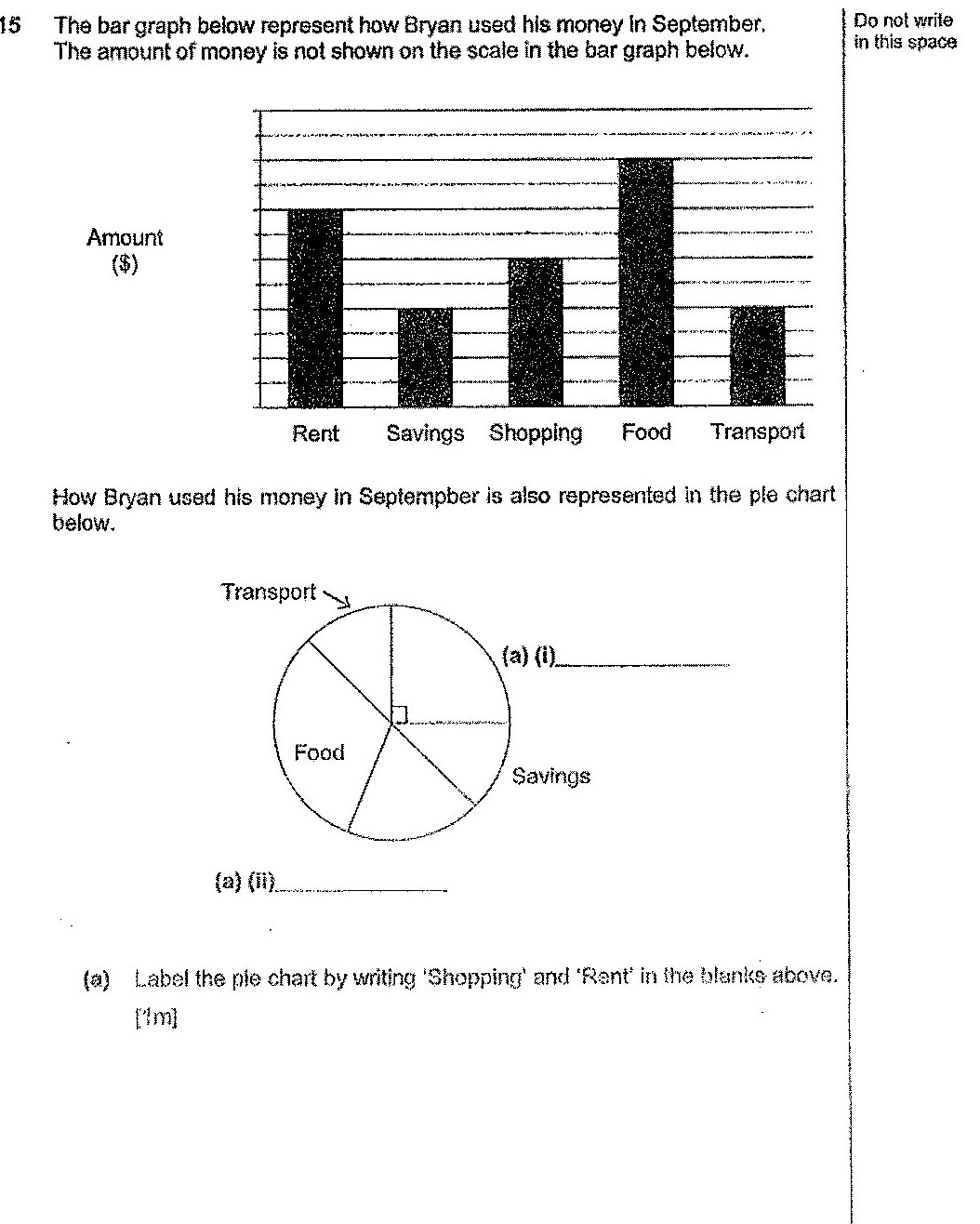
Label the pie chart by writing 'Shopping' and 'Rent' in the blanks above.
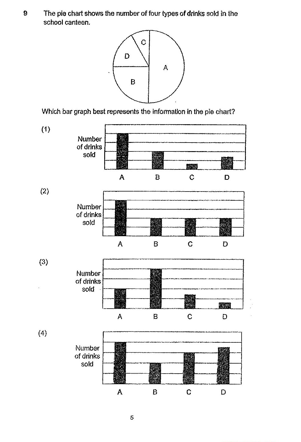
The pie chart shows the number of four types of drinks sold in the school canteen. Which bar graph best represents the information in the pie chart?
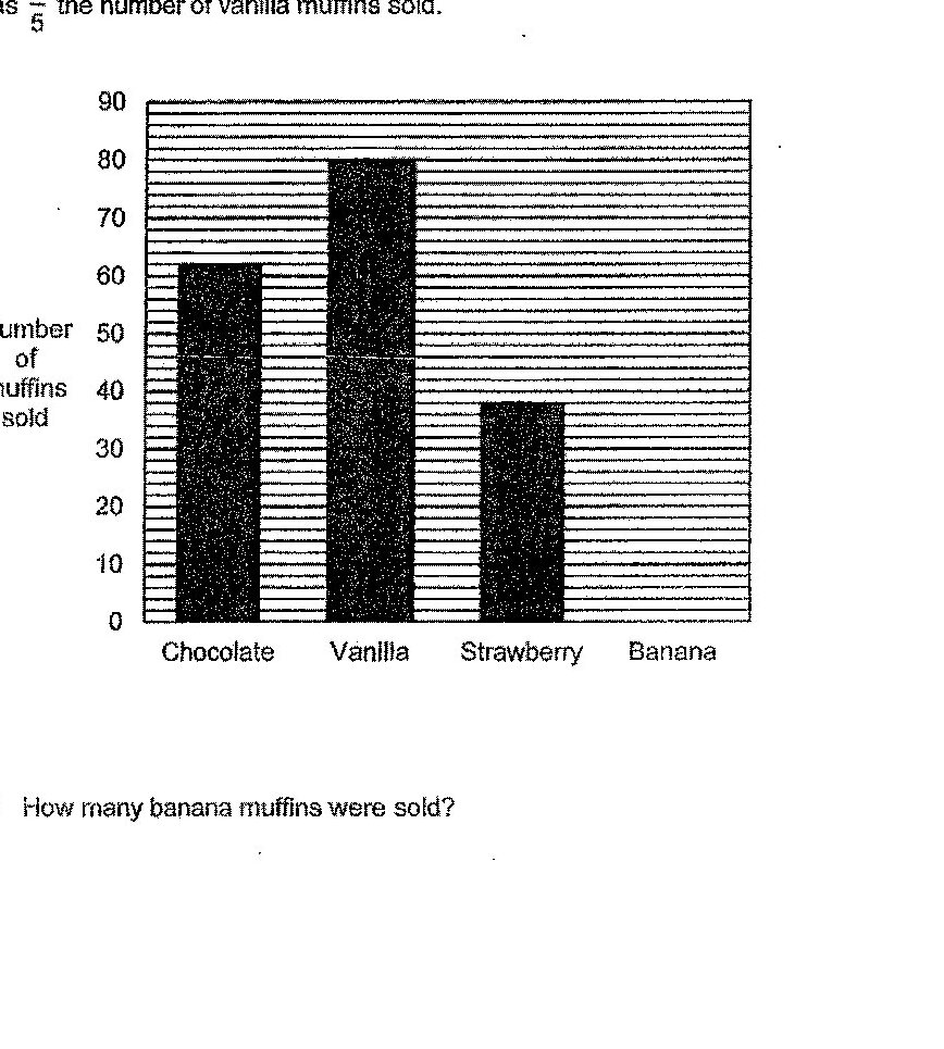
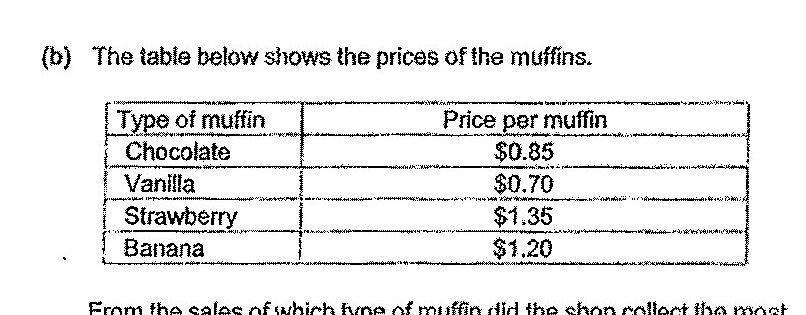
A shop sells four types of muffin. The bar graph shows the number of each type of muffin sold by the shop. The bar for the number of banana muffins sold has not been drawn. The number of banana muffins sold was 2/5 the number of vanilla muffins sold. How many banana muffins were sold?
The table below shows the prices of the muffins. From the sales of which type of muffin did the shop collect the most money? What was the amount of money?
The pie chart shows the number of toy cars each of 4 children sold to a certain store. Which bar graph that represents the information in the pie chart?
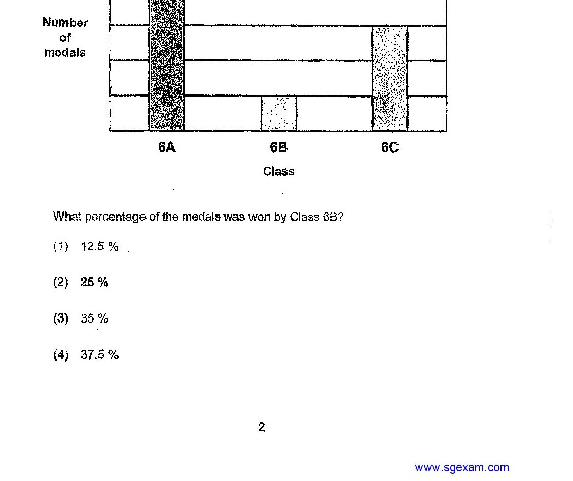
The bar graph below shows the number of medals won by 3 classes during a Sports Meet. What percentage of the medals was won by Class 6B?
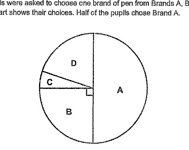
Some pupils were asked to choose one brand of pen from Brands A, B, C or D. The pie chart shows their choices. Half of the pupils chose Brand A. Which bar graph best represents the information in the pie chart above?
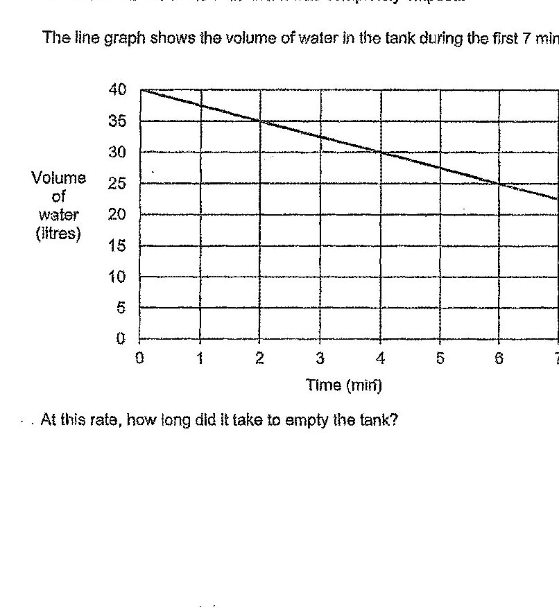
A tank, which was completely filled with water at first, started leaking. Water flowed out of the tank until it was completely emptied. The line graph shows the volume of water in the tank during the first 7 minutes. At this rate, how long did it take to empty the tank?
Who took fewer days to sell half of his pots?
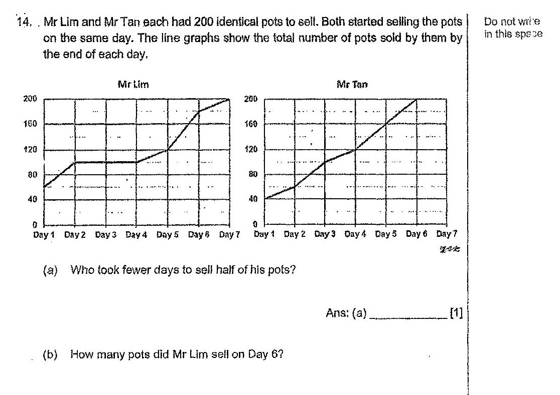
How many pots did Mr Lim sell on Day 6?
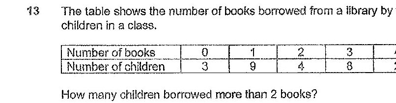
The table shows the number of books borrowed from a library by the children in a class. How many children borrowed more than 2 books?
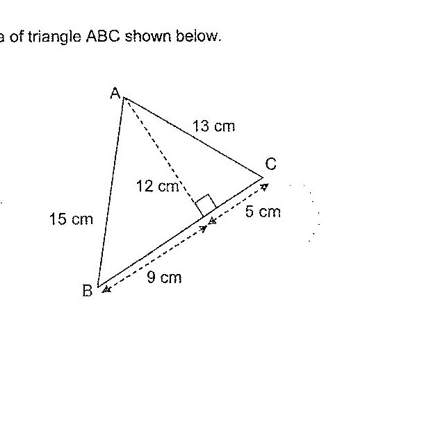
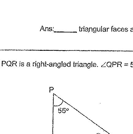
PQR is a right-angled triangle. ∠QPR = 55°. Find ∠x.
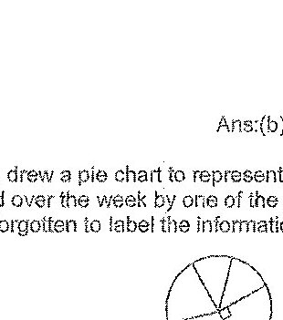
Stephan drew a pie chart to represent the number of plastic bottles collected over the week by one of the classes, 6A or 6B. However, he had forgotten to label the information in his pie chart. Which class, 6A or 6B, does the pie chart represent?
The scores of all the children who participated in a game were recorded. The table shows the number of children with the following scores. A higher score means a better performance. The prize table for their performance is shown below. Each of the statement is either true, false or not possible to tell from the information given above. For each statement, put a tick (✓) to indicate your answer. Statement 1: 40 children participated in the game. Statement 2: Medals were given to 20% of the children. Statement 3: 17 children won only stickers.

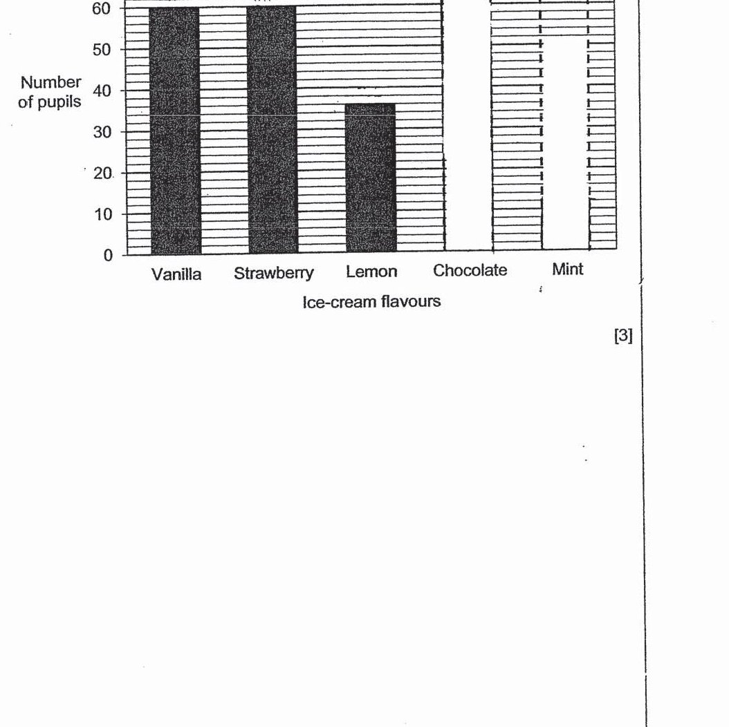
The number of pupils who chose Chocolate ice-cream is six times the number of pupils who chose Mint ice-cream. Draw the bars for the number of pupils who have chosen Chocolate ice-cream and Mint ice-cream in the bar graph below.
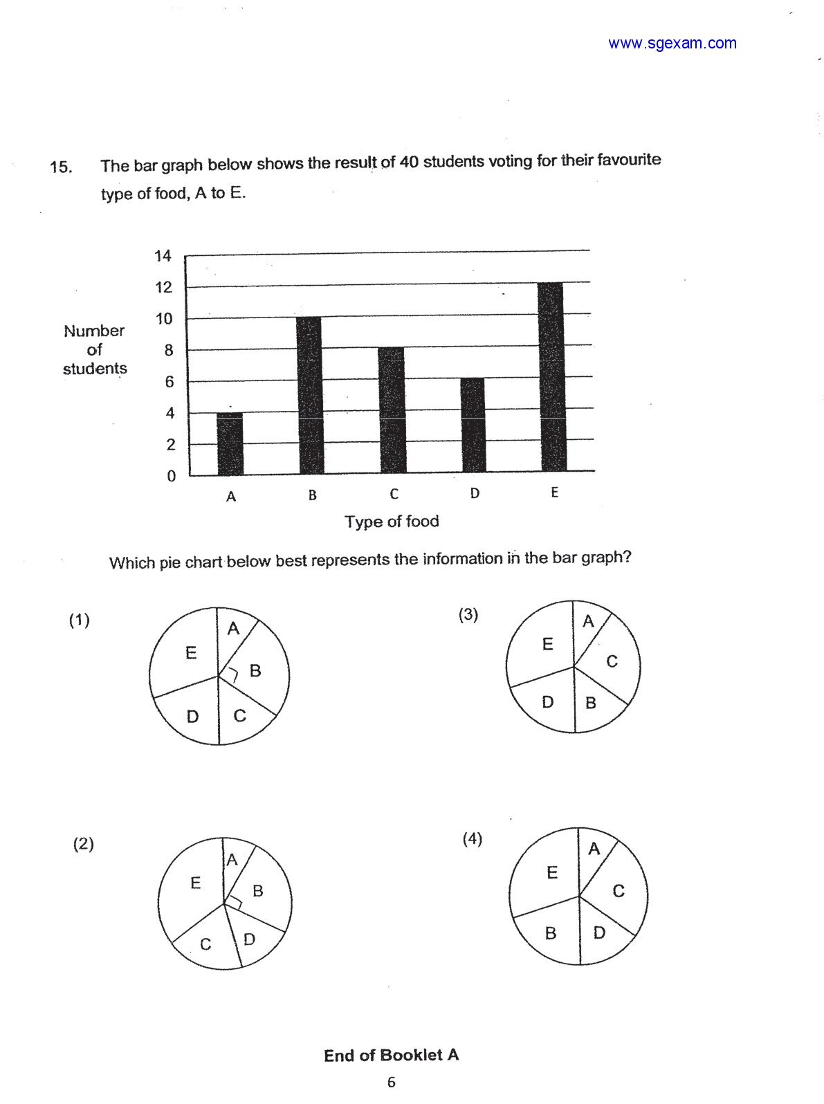
The bar graph below shows the result of 40 students voting for their favourite type of food, A to E. Which pie chart below best represents the information in the bar graph?
Past year papers cover the full exam — browse by subject below.