Data Analysis
Data Analysis Study Notes
Key Concepts
-
Data analysis is the process of collecting, organising, displaying and interpreting data so that patterns and conclusions can be seen clearly.
-
In Lower Secondary Mathematics, data is often collected from:
- experiments
- surveys
- observations
- measurements
-
Data means information collected during an investigation.
- Example: temperatures measured every hour, number of seeds germinating, or reaction times of students.
-
Data can be shown in different forms. Common statistical diagrams include:
- dot diagrams
- stem-and-leaf diagrams
- histograms
-
Different diagrams are useful for different purposes:
- Dot diagrams are good for small sets of data.
- Stem-and-leaf diagrams help you organise data while keeping the original values.
- Histograms are used for grouped continuous data and help show the shape of the distribution.
-
Measures of central value help us describe a data set using one representative number:
- mean
- median
- mode
-
When comparing data sets, we should not only look at the average value, but also:
- how spread out the data is
- whether the data is clustered
- whether there are unusually high or low values
- whether one graph is more symmetrical or skewed than another
-
Interpreting statistical diagrams means reading information from graphs or charts and explaining what the data shows.
Dot Diagrams
- A dot diagram displays data values using dots placed above a number line.
- Each dot represents one piece of data.
- If several values are the same, the dots are stacked vertically.
What a dot diagram shows
- the individual values in the data set
- the most common value
- the spread of the data
- clusters and gaps
- any unusual values
When to use it
- for small data sets
- when exact values are important
- when the values are not too many
Stem-and-Leaf Diagrams
-
A stem-and-leaf diagram shows data by splitting each number into:
- a stem: the leading digit or digits
- a leaf: the last digit
-
Example:
- 27 can be split into stem 2 and leaf 7
- 43 can be split into stem 4 and leaf 3
-
The stem-and-leaf diagram keeps the original data values, unlike some grouped graphs.
Features
- data must be arranged in ascending order
- leaves are written from smallest to largest within each stem
- a key must always be included to show how to read the numbers
What it helps you see
- the distribution of values
- the smallest and largest value
- the mode
- the median
- clusters and gaps
Histograms
-
A histogram is a graph used to show the frequency distribution of continuous data grouped into class intervals.
-
Continuous data is data that can take any value within a range.
- Example: height, mass, time, temperature
-
In a histogram:
- the horizontal axis shows the class intervals
- the vertical axis shows the frequency or sometimes frequency density
- bars touch each other because continuous data has no gaps between intervals
Important features
- bars are drawn with no spaces between them
- the width of each bar represents the class interval
- the height represents frequency if intervals are equal
- if class widths are unequal, the height represents frequency density
What a histogram shows
- how data is distributed
- which intervals contain the most values
- whether data is spread evenly or clustered
- the general shape of the data
Mean, Median and Mode
These are three common ways to describe the centre of a data set.
Mean
- The mean is the average value.
- It is calculated by:
- The mean uses all the values in the data set.
- It can be affected by extreme values.
Median
-
The median is the middle value when the data is arranged in order.
-
If there is an odd number of values:
- the median is the middle value
-
If there is an even number of values:
- the median is the average of the two middle values
-
The median is less affected by extreme values than the mean.
Mode
- The mode is the value that occurs most often.
- A data set may have:
- one mode
- more than one mode
- no mode if no value repeats
When to use each average
| Situation | Best average to use |
|---|---|
| Data has an outlier (extreme value) | Median — not affected by the outlier |
| Data is categorical (e.g. favourite colour, shoe size) | Mode — only average that works for non-numerical data |
| Data is evenly spread with no outliers | Mean — uses all values, gives most accurate centre |
- Exam questions may ask: “Which average best represents the data? Explain your answer.”
- If there is an outlier, say: “The median is a better representative because the mean is pulled up/down by the extreme value.”
- If data is categorical, say: “The mode is the only appropriate average for categorical data.”
Comparing Data Sets
When comparing two or more sets of data, look at:
- centre
- compare mean, median or mode
- spread
- see whether the values are close together or widely spread out
- range
- the difference between the largest and smallest values
- shape
- whether the data is symmetrical, clustered, or skewed
- consistency
- a smaller spread usually means more consistent results
Range
- A small range means the data is less spread out.
- A large range means the data is more spread out.
Why comparison matters in Science
- to decide which result is more reliable
- to tell which condition gives higher or lower values
- to identify variation in repeated measurements
- to compare groups in experiments
Interpreting Statistical Diagrams
To interpret a statistical diagram, you should be able to:
- read exact values correctly
- identify the highest and lowest values
- state the most common value or interval
- describe patterns
- compare groups
- draw reasonable conclusions based on the data
Useful observations to make
- “Most of the values are between … and …”
- “The highest frequency is in the interval …”
- “The data is spread from … to …”
- “There is a cluster around …”
- “There is a gap between … and …”
- “Set A has a higher mean than Set B.”
- “Set B is more consistent because its values are less spread out.”
Be careful
- conclusions must match the data shown
- do not guess values not supported by the graph
- always include units where needed
Important Definitions
-
Data: information collected from observations, measurements, experiments or surveys.
-
Data analysis: the process of organising, presenting and interpreting data to find patterns and draw conclusions.
-
Frequency: the number of times a value occurs.
-
Distribution: the way data values are spread out over a range.
-
Dot diagram: a statistical diagram in which each data value is represented by a dot above a number line.
-
Stem-and-leaf diagram: a diagram that organises data by separating each value into a stem and a leaf.
-
Stem: the leading digit or digits of a number in a stem-and-leaf diagram.
-
Leaf: the final digit of a number in a stem-and-leaf diagram.
-
Key: a note used in a stem-and-leaf diagram to show how to read the stems and leaves.
-
Histogram: a graph of grouped continuous data in which touching bars represent frequencies in class intervals.
-
Continuous data: data that can take any value within a given range.
-
Class interval: a range of values grouped together in a table or histogram.
-
Mean: the sum of all data values divided by the number of values.
-
Median: the middle value in an ordered set of data.
-
Mode: the value that appears most frequently in a data set.
-
Range: the difference between the highest and lowest values in a data set.
-
Cluster: a group of values close together.
-
Gap: a part of the data range where there are no values.
-
Outlier: a value that is much higher or lower than the others.
-
Interpret: to explain what the data shows.
Worked Examples
Worked Example 1: Finding Mean, Median and Mode
A group of students recorded the number of hours they slept: 8, 7, 6, 8, 9, 7, 8
Step 1: Arrange the data in order
6, 7, 7, 8, 8, 8, 9
Step 2: Find the mean
Add all the values:
Number of values = 7
Mean = 7.57 hours
(You may round appropriately, for example to 7.6 hours.)
Step 3: Find the median
There are 7 values, so the median is the 4th value.
Median = 8 hours
Step 4: Find the mode
The value that appears most often is 8.
Mode = 8 hours
Final answers
- Mean = 7.57 hours
- Median = 8 hours
- Mode = 8 hours
Worked Example 2: Constructing a Stem-and-Leaf Diagram
The masses of 10 bags of rice are: 21, 25, 24, 27, 31, 29, 22, 24, 33, 28
Step 1: Arrange the data in order
21, 22, 24, 24, 25, 27, 28, 29, 31, 33
Step 2: Identify stems and leaves
- 21 → stem 2, leaf 1
- 22 → stem 2, leaf 2
- 24 → stem 2, leaf 4
- 24 → stem 2, leaf 4
- 25 → stem 2, leaf 5
- 27 → stem 2, leaf 7
- 28 → stem 2, leaf 8
- 29 → stem 2, leaf 9
- 31 → stem 3, leaf 1
- 33 → stem 3, leaf 3
Step 3: Draw the diagram
Stem | Leaf
 2   | 1 2 4 4 5 7 8 9
 3   | 1 3

Key: 2 | 1 = 21
Step 4: Interpret the data
- Lowest mass = 21
- Highest mass = 33
- Mode = 24
- Most values are in the 20s
Worked Example 3: Comparing Two Data Sets
Two groups of students measured the time taken to complete a task.
- Group A: 12, 13, 14, 15, 16
- Group B: 10, 13, 14, 15, 18
Step 1: Find the mean for Group A
Mean of Group A = 14
Step 2: Find the mean for Group B
Mean of Group B = 14
Step 3: Find the range for each group
For Group A:
Range of Group A = 4
For Group B:
Range of Group B = 8
Step 4: Compare the groups
- Both groups have the same mean: 14
- Group A has a smaller range
- Group A is more consistent
- Group B is more spread out
Final conclusion
Although both groups have the same average time, Group A is more consistent because its data has a smaller range.
Worked Example 4: Reading a Histogram
A histogram shows the heights of 30 students:
| Height (cm) | Frequency |
|---|---|
| 150–155 | 4 |
| 155–160 | 8 |
| 160–165 | 12 |
| 165–170 | 5 |
| 170–175 | 1 |
Questions:
1. How many students are between 155–165 cm tall?
- Add the frequencies for the two intervals:
- 8 + 12 = 20 students
2. What is the modal class?
- The modal class is the interval with the highest frequency.
- The 160–165 cm interval has frequency 12, which is the highest.
- Modal class = 160–165 cm
3. What fraction of students are 165 cm or taller?
- Students in 165–170 cm: 5
- Students in 170–175 cm: 1
- Total at 165 cm or taller: 5 + 1 = 6
- Fraction = 6/30 = 1/5
Reminder: In a histogram, the bars touch because the data is continuous — there are no gaps between class intervals.
Common Mistakes to Avoid
- Forgetting to arrange data in ascending order before finding the median.
- Choosing the wrong middle value for the median.
- Forgetting that for an even number of values, the median is the average of the two middle values.
- Adding wrongly when calculating the mean.
- Dividing by the wrong number when finding the mean.
- Confusing mode with median.
- Forgetting to include a key in a stem-and-leaf diagram.
- Writing leaves in random order instead of ascending order.
- Leaving gaps between bars in a histogram.
- Drawing a bar chart instead of a histogram.
- Using unequal scales without noticing.
- Reading the axes wrongly.
- Ignoring units such as cm, g, s or °C.
- Comparing only averages and not spread.
- Making conclusions that are not supported by the data.
- Ignoring outliers that may affect the mean.
Exam Tips
-
Always state the unit in your answer if the data has one.
- Example: 8 cm, 15 s, 27 °C
-
When asked to compare data sets, mention both centre and spread.
- Good phrase: “Set A has a higher mean, but Set B is more consistent because it has a smaller range.”
-
For median questions:
- first write the data in order
- then clearly identify the middle value
-
For mean questions:
- show the total and the number of values
- this earns method marks in working questions
-
For stem-and-leaf diagrams:
- write stems on the left
- leaves on the right
- include a key
- arrange leaves in ascending order
-
For histogram questions:
- bars must touch
- label both axes
- use a suitable scale
-
When interpreting a graph, use data from the diagram in your statement.
- Example: “The highest frequency is in the 20–29 interval.”
-
Avoid vague statements like:
- “It is better”
- “It is bigger”
- Instead say:
- “It has a higher mean”
- “It has a smaller range”
- “It shows greater variation”
-
If there is an unusual value, mention it.
- Example: “There is an outlier at 35 cm, which may affect the mean.”
-
In Science, when comparing repeated measurements, use:
- more consistent
- less spread out
- greater variation
- more reliable
Quick Summary
- Data analysis means organising, presenting and interpreting data.
- A dot diagram uses dots above a number line to show individual values.
- A stem-and-leaf diagram keeps the original data values and must include a key.
- In a stem-and-leaf diagram, leaves must be arranged in ascending order.
- A histogram is used for continuous data grouped into class intervals.
- In a histogram, bars touch because the data is continuous.
- Mean = total of values ÷ number of values.
- Median = middle value in ordered data.
- Mode = most frequent value.
- Range = highest value − lowest value.
- To compare data sets, look at average values and spread.
- When interpreting diagrams, use exact data and include units in your answers.
The dot diagram shows the number of siblings in the families of 16 students.
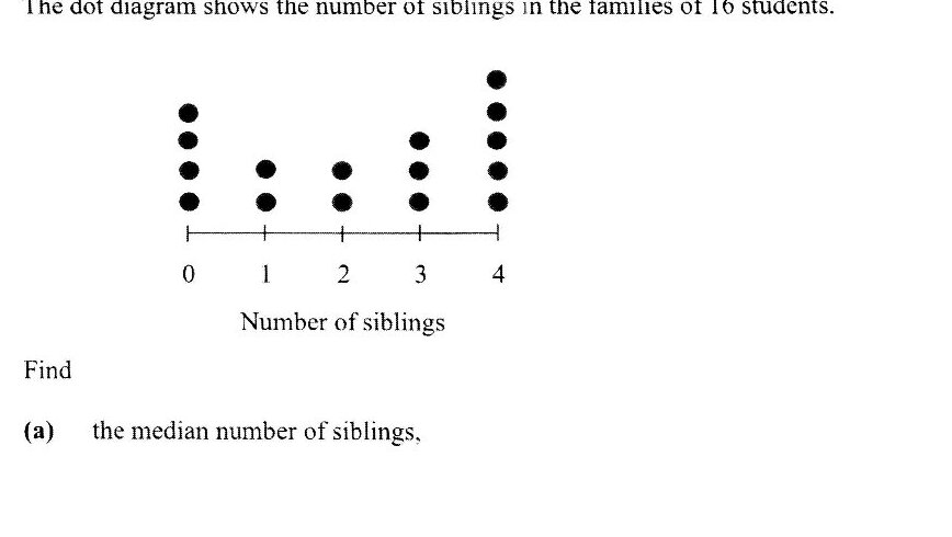
Find the median number of siblings.
Find the mean number of siblings.
A survey was conducted among 50 families to find out the number of times they travelled together as a family in a year. The data collected is shown in the table below.
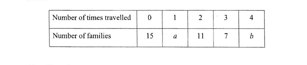
If the mean number of times they travelled as a family is 1.68, show that a + 4b = 41.
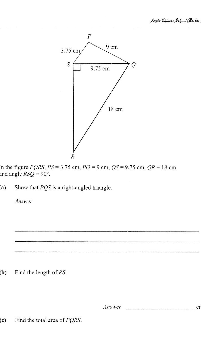
Find the total area of PQRS.
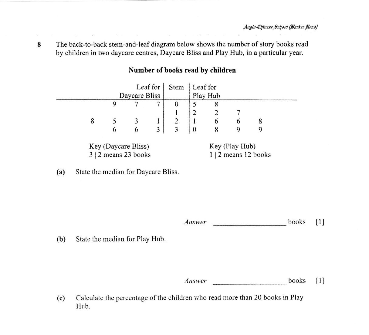
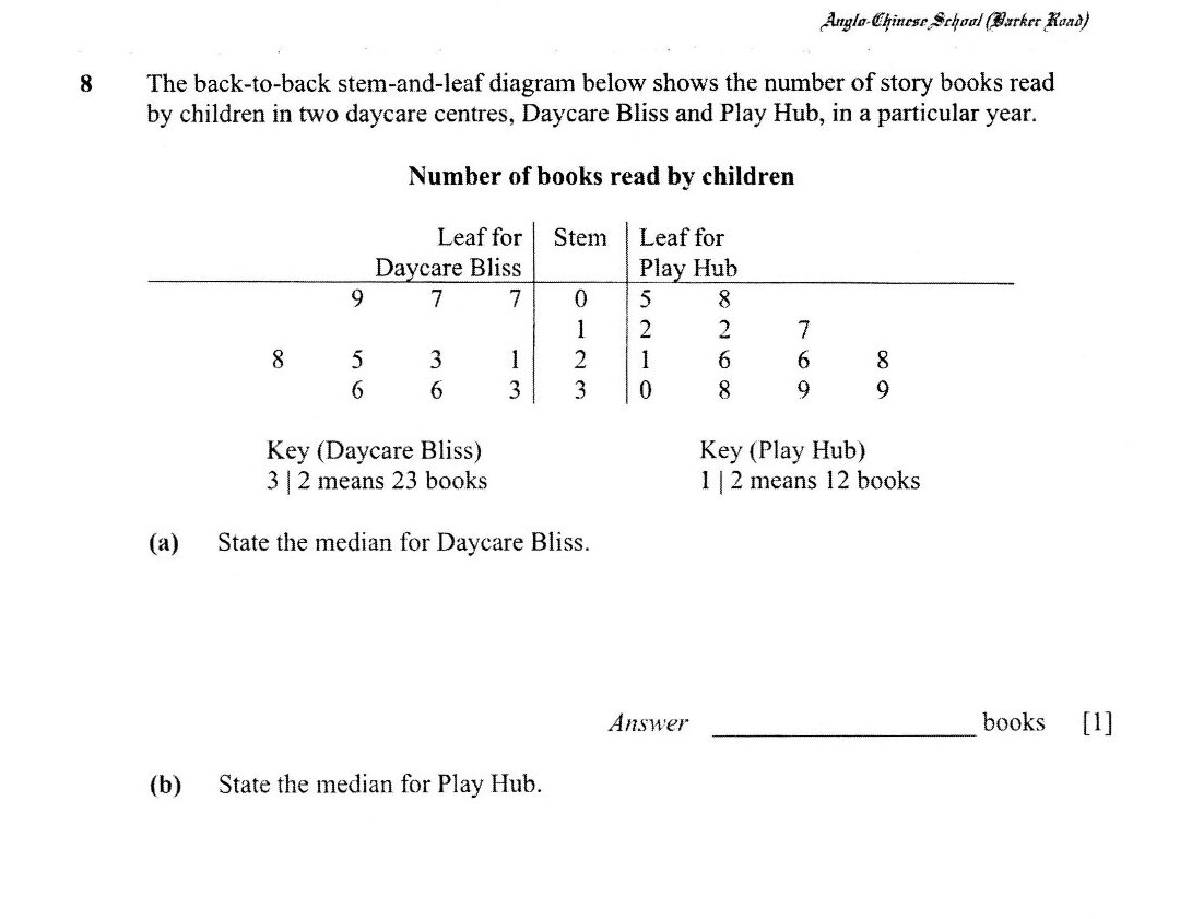
The back-to-back stem-and-leaf diagram below shows the number of story books read by children in two daycare centres, Daycare Bliss and Play Hub, in a particular year.
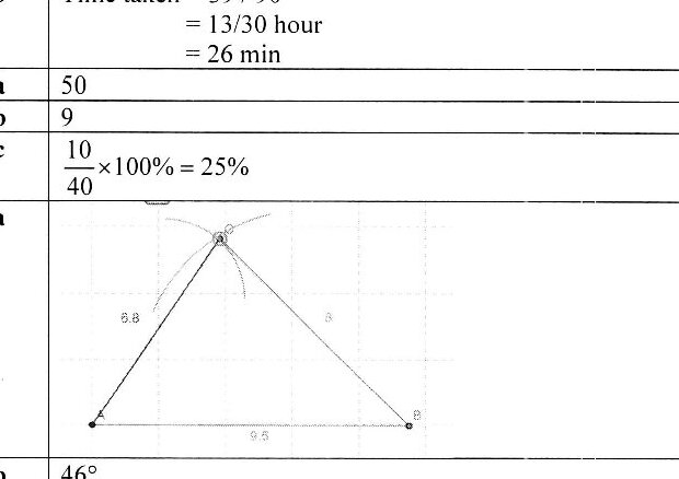
Construct the triangle PQR where PQ = QR = 7 cm and PR = 5 cm.
Measure and write down the size of angle QPR.
Calculate the percentage of the children who read more than 20 books in Play Hub.
State one advantage of using stem-and-leaf diagram in this case.
Find the number of students who scored at least 40 marks.
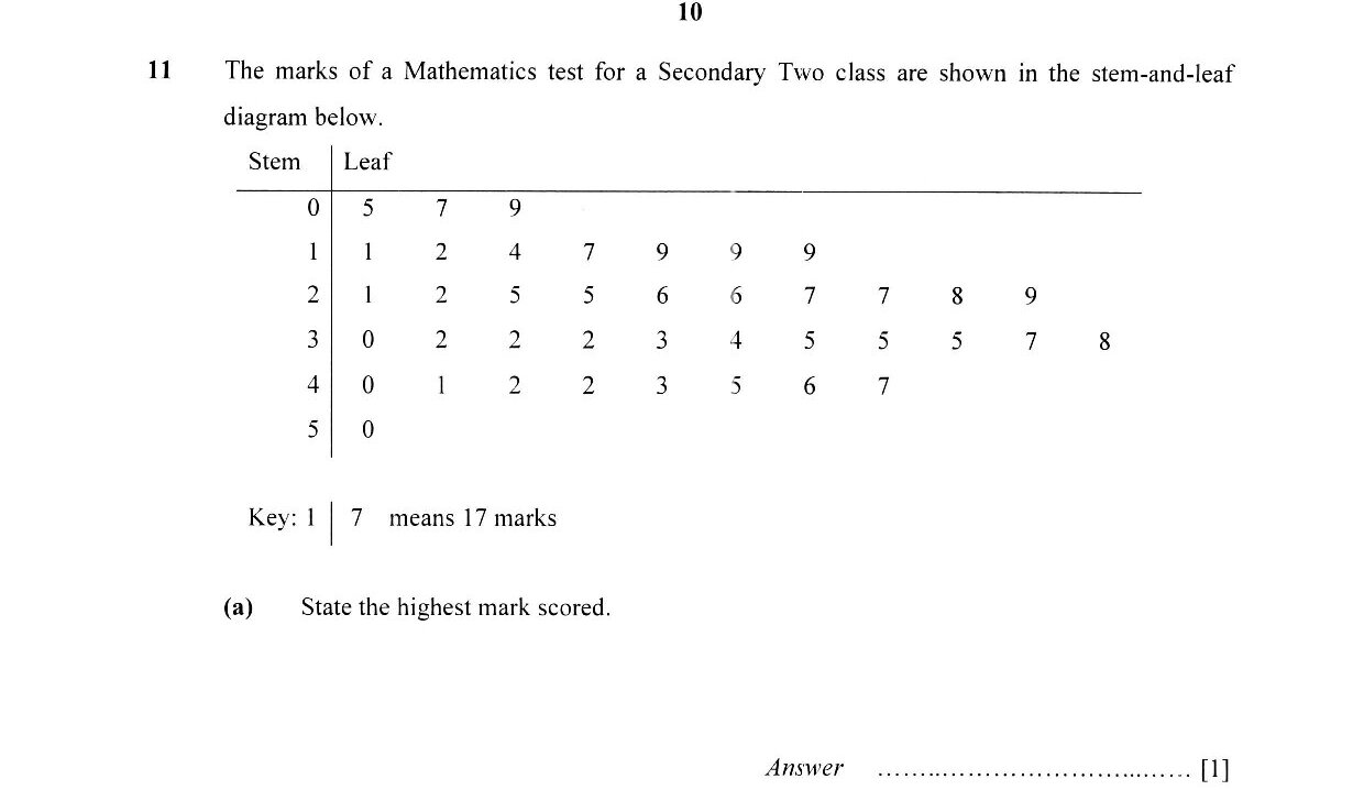
Find the percentage of students who scored less than 20 marks.
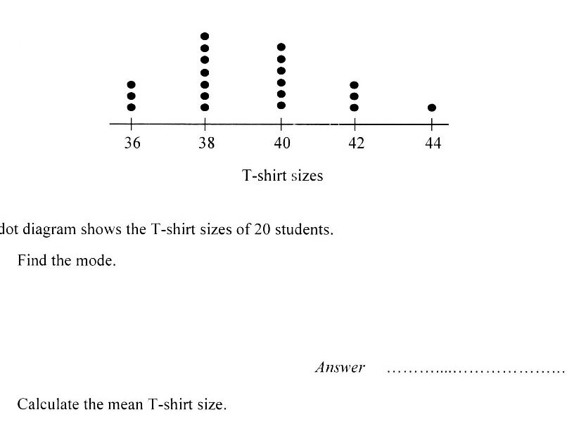
Calculate the mean T-shirt size.
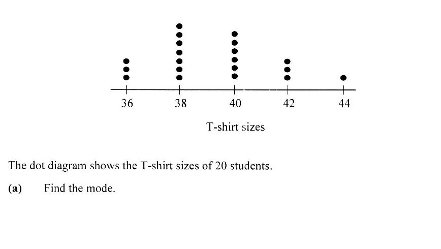
Find the median.
The mean of seven numbers is 36. Four of the numbers are 17, 20, 35 and 42. The rest of the numbers are each equals to x. Find the value of x.
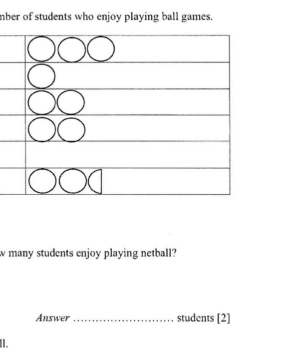
The pictogram below represents the number of students who enjoy playing ball games. There are 26 students in total. How many students enjoy playing netball?
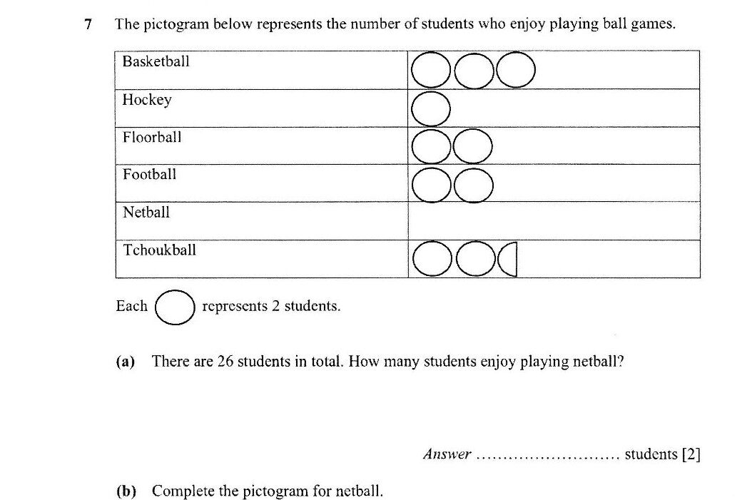
Complete the pictogram for netball.
State the modal time spent gaming.
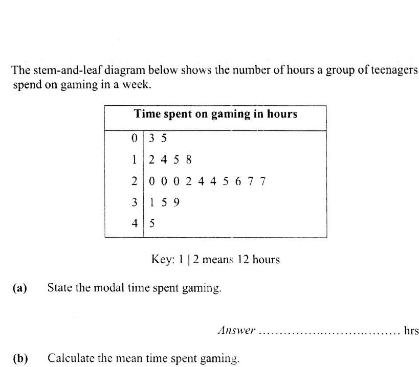
Calculate the mean time spent gaming.
Find the median time spent gaming.
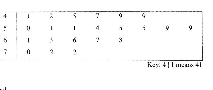
The stem-and-leaf diagram shows the weight, in kilograms, of the students in a class.
Solve the following equation: (2x + 5)/3 = (x − 1)/2
Find the number of students with weight more than 55kg.
Find the median weight.
The stem-and-leaf diagram shows the weight, in kilogram, of the students in a class. Find the number of students in the class.
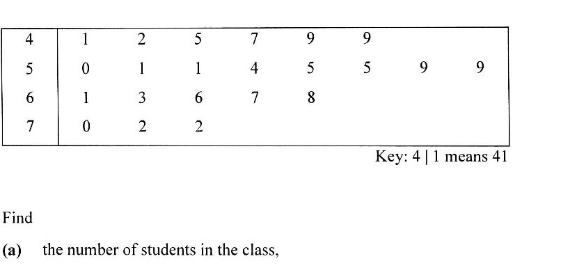
Find the number of students with weight more than 55 kg.
Find the median weight.
Past year papers cover the full exam — browse by subject below.
View All Papers ›